Incident Reporting Identity System
<!--
Work info
-->
Client:
AEMO
Role:
Led creative direction, research, concept development, visual exploration, logo refinement, and asset preparation.
Year:
2025
Overview
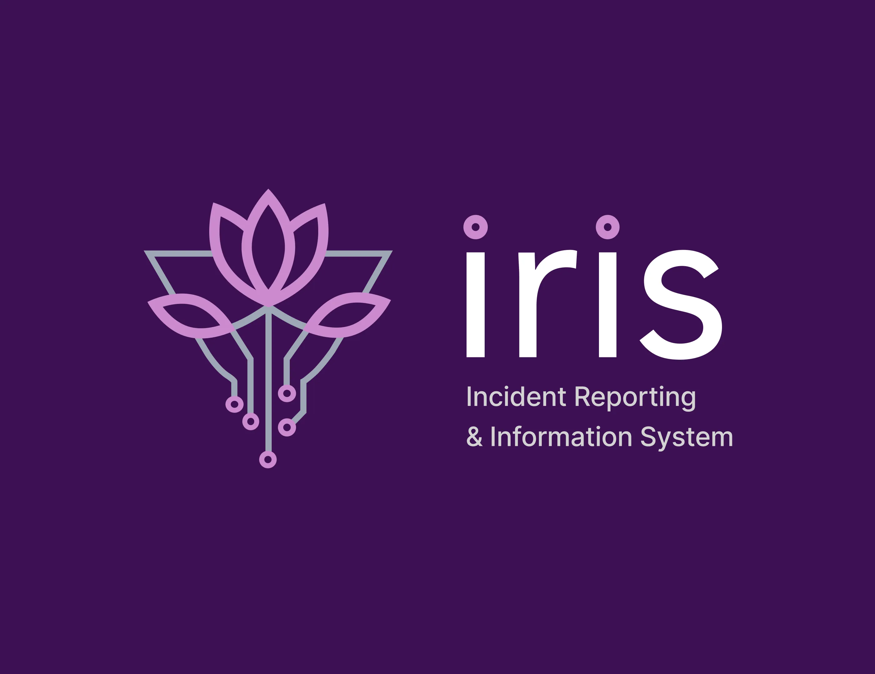
I designed the visual identity for IRIS, an incident reporting and operational visibility project within AEMO. The project team needed a logo and asset system that felt distinct enough to give IRIS its own presence, while staying connected to AEMO's broader visual language. The identity needed to work across digital dashboards, presentation decks, documentation, and internal communications. The goal was to create a mark that reflected the project's focus on clarity, coordination, and reliability, and could be applied consistently from launch onward.
Problem
IRIS needed a visual identity that could unify how the project was represented across internal communications, dashboards, and presentations. Without a clear identity, project materials risked blending into generic AEMO documentation or feeling inconsistent across touchpoints.
The challenge was creating something distinctive enough to give the project team ownership and pride, without drifting from AEMO's established visual language. The identity also needed to be practical, working across multiple formats and backgrounds without requiring ongoing design support.
Role
I led the creative direction and delivery of the IRIS identity, covering research, concept development, visual exploration, logo refinement, and final asset preparation.
I worked independently from brief through to rollout, collaborating with the IRIS project team for feedback and alignment at key stages.
Approach
Researched the concept and brand context
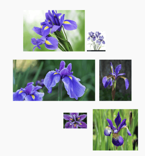
I researched the iris flower and its symbolism, particularly its connection to clarity, insight, and perception. I also reviewed AEMO’s broader visual language to understand how far the identity could stretch while still feeling connected to the organisation.
Defined the visual direction
I framed the brief around three qualities: clarity, coordination, and reliability.
The logo needed to feel distinctive enough for IRIS to stand alone, but still aligned enough to sit comfortably within AEMO’s environment. The scope focused on logo creation and asset rollout rather than a full brand system.
Explored and refined the identity
I explored several directions through sketching and concept development, combining organic forms from the iris flower with geometric structures that reflected AEMO’s technical and data-driven context.

After presenting concepts to the IRIS team, I refined the preferred direction into a stylised iris mark that balanced human meaning with structured precision.
Delivered a practical logo suite
I packaged the final logo suite for use across digital, print, and presentation contexts.
This included stacked and horizontal lockups, symbol-only versions, and light and dark variants aligned to AEMO’s palette. The handover focused on usability and consistency so the team could apply the identity confidently from launch onward.

Workflow
The workflow moved from symbolism and brand context to concept exploration, refinement, and practical rollout.
I started by researching the iris flower and its associations with clarity, insight, and perception. I also reviewed AEMO’s visual language to understand how the identity could feel distinctive without drifting away from the parent brand.
From there, I defined three guiding qualities: clarity, coordination, and reliability. These principles shaped the visual direction and helped keep the logo focused on the project’s purpose rather than becoming a decorative mark.
Challenges & solutions
Balancing distinction with brand alignment
I used AEMO's existing colour palette and visual cues as guardrails while exploring a distinctive symbol rooted in the iris flower. This gave IRIS a clear identity that still felt like it belonged within the organisation.
Translating abstract qualities into a simple mark
I used the iris flower as a conceptual anchor, then simplified its form through geometry and symmetry. This grounded the mark in something recognisable while keeping it structured and purposeful.
Supporting multiple internal use cases
I created a flexible asset library with stacked, horizontal, and symbol-only variations in light and dark modes, reducing the need for ad hoc design work across different contexts.
Outcomes & next steps
The IRIS identity was adopted immediately across presentation decks, dashboards, and project documentation. The project team displayed the logo prominently during launch, using it as a visible marker of shared purpose across the operations space.
The identity gave the team a confident and consistent visual presence within AEMO, supporting clearer communication and stronger project cohesion.
Next steps would include extending the identity into a lightweight set of guidelines covering typography, iconography, and layout patterns if the project's communication needs expanded. Additional testing across accessibility contexts, particularly contrast and legibility at smaller sizes, would also strengthen long-term usability.